ServiceNow
In 2019, I joined the ServiceNow digital marketing team to work on various projects to increase traffic and improve the user experience at servicenow.com. I worked with the professional UX team, the content marketing team, the visual branding team, the developer team, and the producer team. Within all the works that I have done, I am introducing only a few projects that reflect my thinking process and how I provide value to the company.
Direct Link: servicenow.com
Duration:
8 Month
Team:
3 visual designer, 3 UX designer, 2 UX researcher, 2 UX engineer, 1 business analyst and 1 PM
Tools:
Sketch, Principle, InVision, Illustrator, After Effects
Deliverables:
3 Page level projects, Org level customer persona project, and various components improvement, maintaining design component library
Background
ServiceNow
ServiceNow is a cloud-based enterprise platform that offers IT solutions like HR, ticketing, operations, CRM, and more. ServiceNow Digital Marketing helps build public websites that increasing potential customers, maintaining current customers, building trust, and reliability. Our team allows users overall user experience on the site by working with the visual brand team, SEO, business unit owners, content team, and developer team to launch pages successfully and achieve goals.
My Role
I am a UX designer in the UX team working with two other designers to take different projects and requests from different business units to solve users' problems and align with business goals. I improved UX processes, building and redesigning reusable components, redesigning the homepage, investor page, and product pages.
introduction
Promoting a Product on the page
Problem Space:
The task is to create components that help the user quickly identify new features or products. The current one we are using is called the content block, which is overly large and does not stand out well against the other content. Existing components are not meant to be redirect attention.
Goal:
Increasing attention
Increase CTR of the promotional component
Decrease bounce rate
Define
Tackle Down the Problem
Understanding the landscape is essential. I talked to previous designers who worked on these components, and worked with business analysts to set up expectations, write down possible use cases and possible work resources. We need a component that is quickly catching attention and creating awareness, also fits all the requirements.
Current Design
Stakeholder Requirements
1. It needs to stand out like a promotion rather than the other story elements on the page.
2. Applying brand color, and typography guidelines.
3. Can not look like a banner due to banner blindness.
4. It should also apply to a situation like reports promoting, no image promotions, responsive to different screen sizes, and listed use cases.
Promotional Use Cases
• Product Release (i.e. New York Release)
• Live event (i.e. Keynote)
• Event Registration (i.e. Register for Knowledge 2020)
• Company Announcement (i.e. New CEO)
• Cross Sell (Now Creators)
• Featured Stories (Forbes Article)
• Survey (Request Feedback)
• Featured Reports (Download Gartner report)
• Webinar (Register, Watch webinar)
Competitor Analysis
So what are we really building?
Types of Ad promotion:
Native promotion
Hanging Banner Frame Ads(shows on the bottom of the page)
Below Article ads
Rich media ads (interactive, i.e., button on the video)
Interstitials ads (Full-screen ads, Pop-ups, or ad as a splash screen)
Is it an Ad?
There are several ways how advertiser pays for the ads, either pay for each impression or clicks.
We might need to locate the ads comfortably for users. It should be smooth where the user barely recognizes it was an ad.
According to the study, several types of ads might be implemented. Those, well known as inventory, should be less distracting and could maintain the app speed performance.
ServiceNow External Ad Example
Insight Conclusion:
Not interrupt or surprise your user, be polite and predictable to built trust.
Priorities business goals present the most valuable content first.
Don’t delay to deliver the main content.
Personalize the relevance of the content.
Self-promotion is even more likely to generate distrust and dislike if done too aggressively.
Selecting the right wording for your ad is crucial to click-through. Right wording will increase 50 % of your CTR.
The search engine is the best for web promotions, cheap, fast, no harm.
Iterations
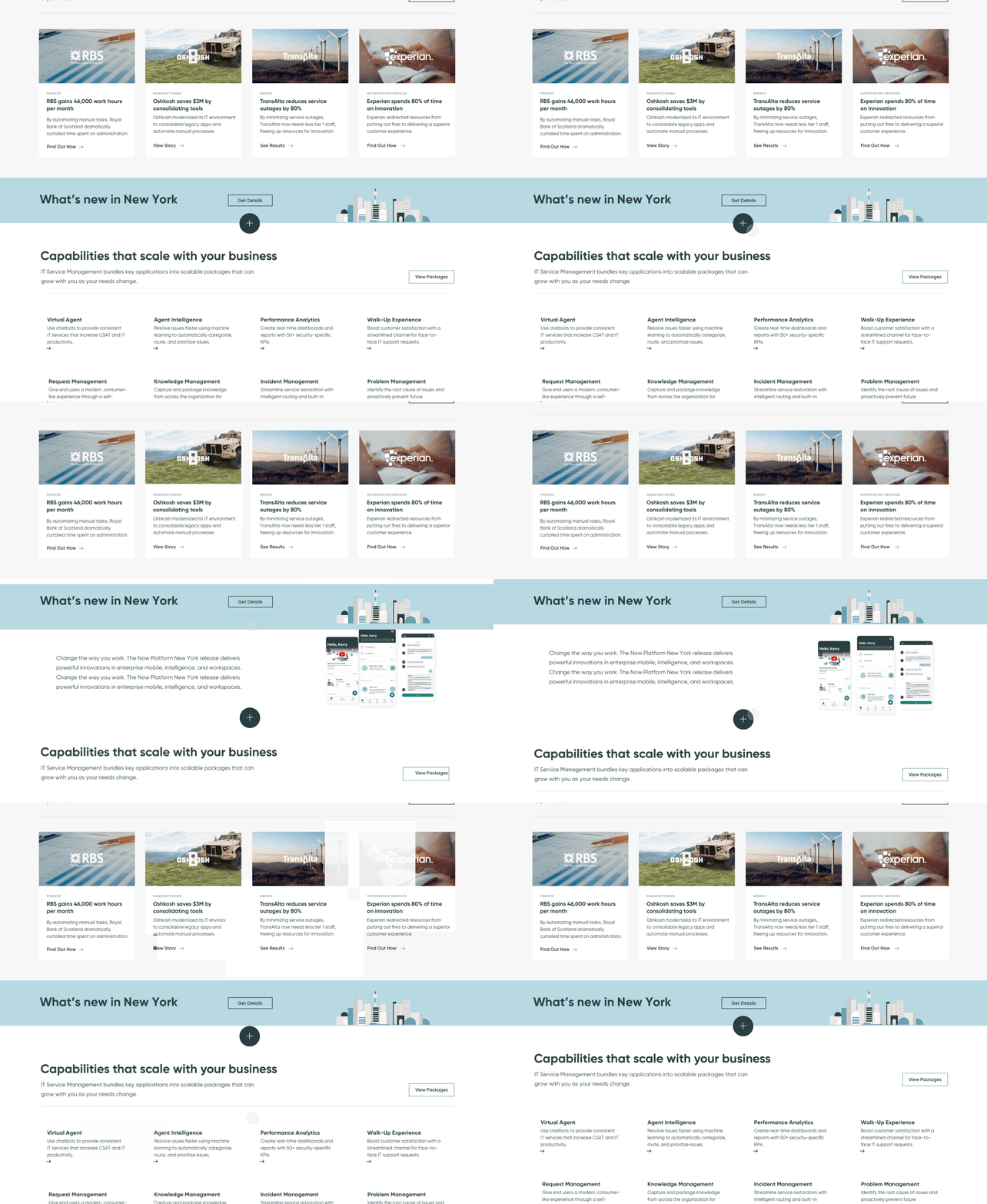
I tried showing iterations and ideas to the stakeholders and team to get buy-in. In the end, we picked three that serve the requirements and purpose to conduct user testing.
User Testing
Testing Script
Spend a few minutes to learn more about this product. Please think out loud as you review this page
Without leaving this page, find information about the latest product innovations from ServiceNow.
What section of this page was most memorable, and why?
Finding the new release section was [7-point Rating Scale: Very difficult to Very easy]
How would you rate the new release section? Explain your answer [7-point Rating Scale: Not very appealing to Very appealing]
What do you expect to happen if you were to click get details? Standard website to visit and why?
Result
Which one is the winner?
Option1:
Not Easy to Find
Attention: User moved from this section.
Content: They thought it’s an event or conference.
Image: Too small.
Option2:
Confusing and lack of context
Attention: The user didn’t know what to do with the add button.
Content: It was not very clear, user did not think it is a new release.
Option3:
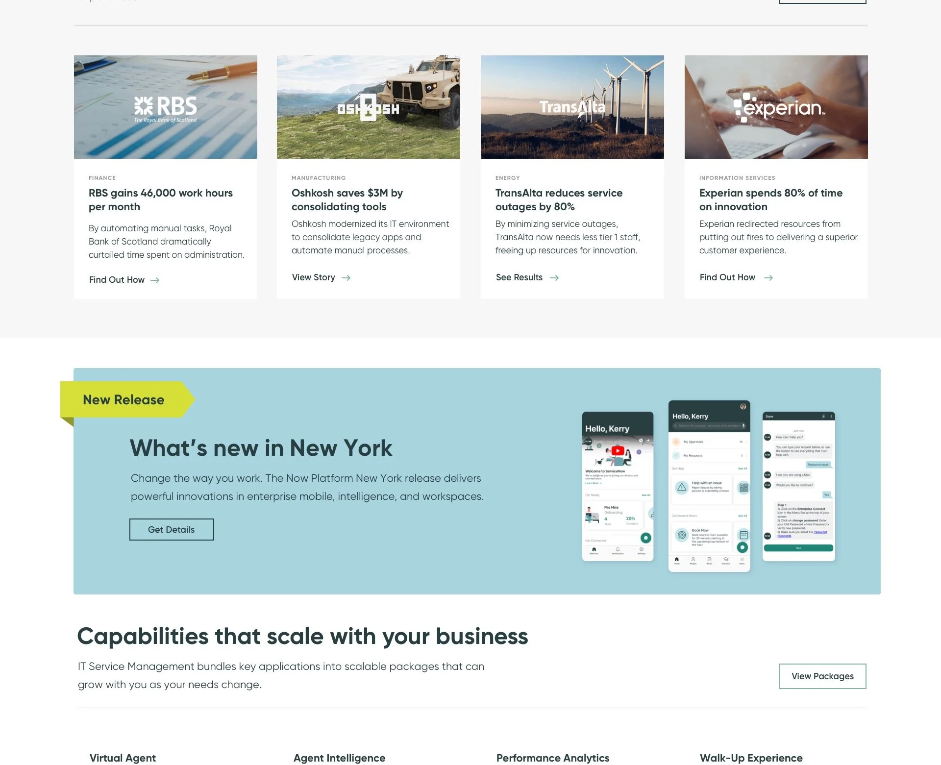
Final Design
Most recognized as Promo
Attention: Instantly know it is a promotion for a new product.
Content: It is vague, and does not add to the meaning.
Impact
Increased 20% of CTR
After added a real big image in context, CTR increased another 15%.
With tested content headline CTR increased by 30% PPV.
introduction
Home Page Redesign
To increase the number of visitors, consistency, and conversion rate, we decided to redesign the entire website.
Based on Adobe Analytics and Crazy egg, we conclude our first round of website model.
Analytics
The unknown, first-time visitor
Return visitor
Known account, first-time visitor
Authenticated/logged in, non-customer
Authenticated/logged in, customer
Heatmap and Clickmap
Goals
Metric Goal
Decrease bounce rate by 30% ( Current bounce rate 60%)
Increase CTR
improve engagement
Story Goal
Be a landing page for awareness traffic – including non-digital (billboard, event, ad, etc.)
A starting place for the product journey
Increase registration to critical events for targeted accounts
Make sure strategy and design are global and work for all regions – easily translatable.
Focus on Prospected Users
Even though 40% of all site visits start at the homepage, our real target users are prospective users in the awareness stage. The rest of the 30% of traffic will drive away from the navigation, and 20% will immediately click the search.
Pain points:
Have a hard time understanding what product solution we offer immediately from the home page.
To get an initial introduction but could not find all product lists, choose to go with navigation.
Overly repeatable content, without a clear CTR and low exposure
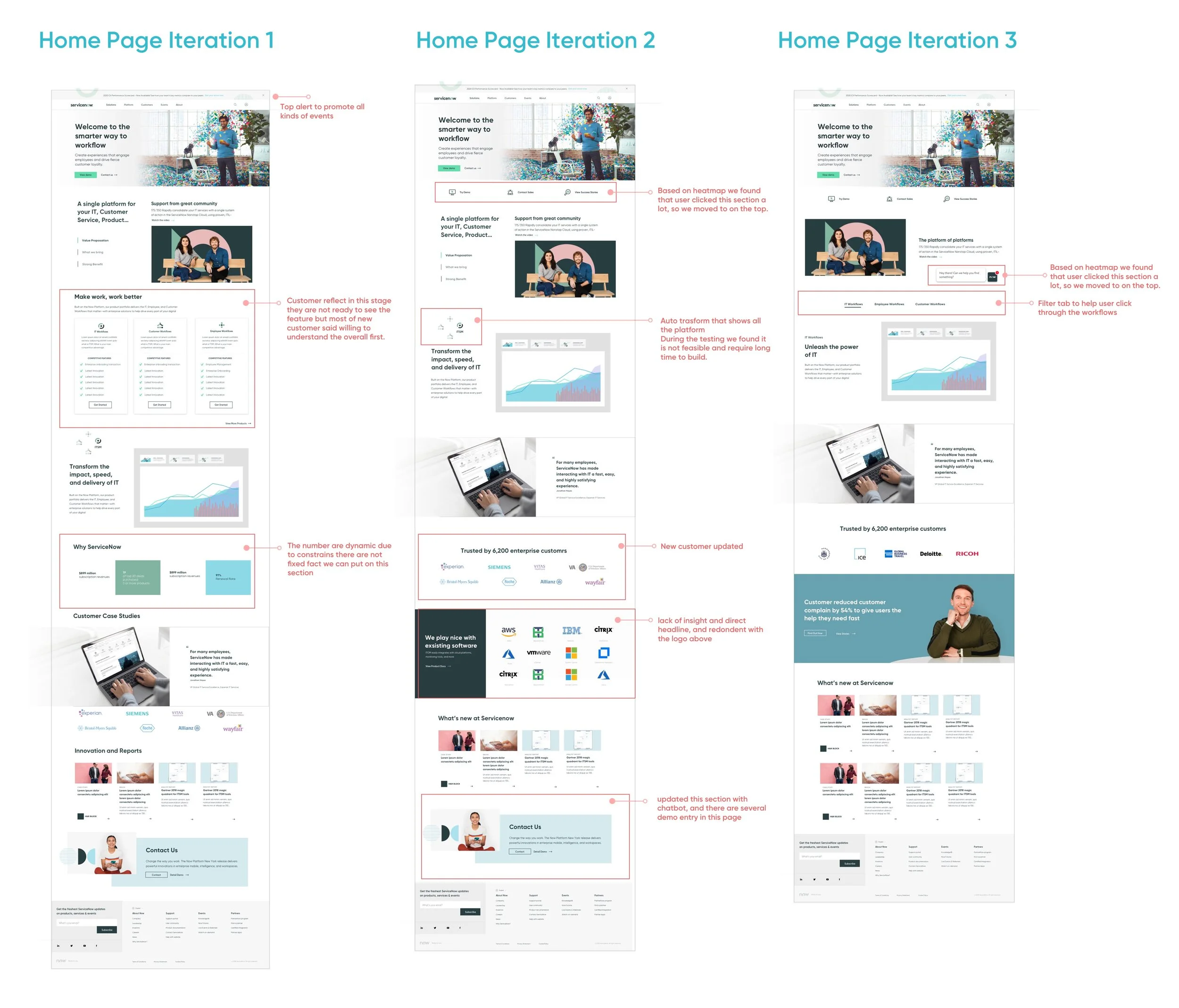
Iterations
V1: Made product features easier to read at a glance.
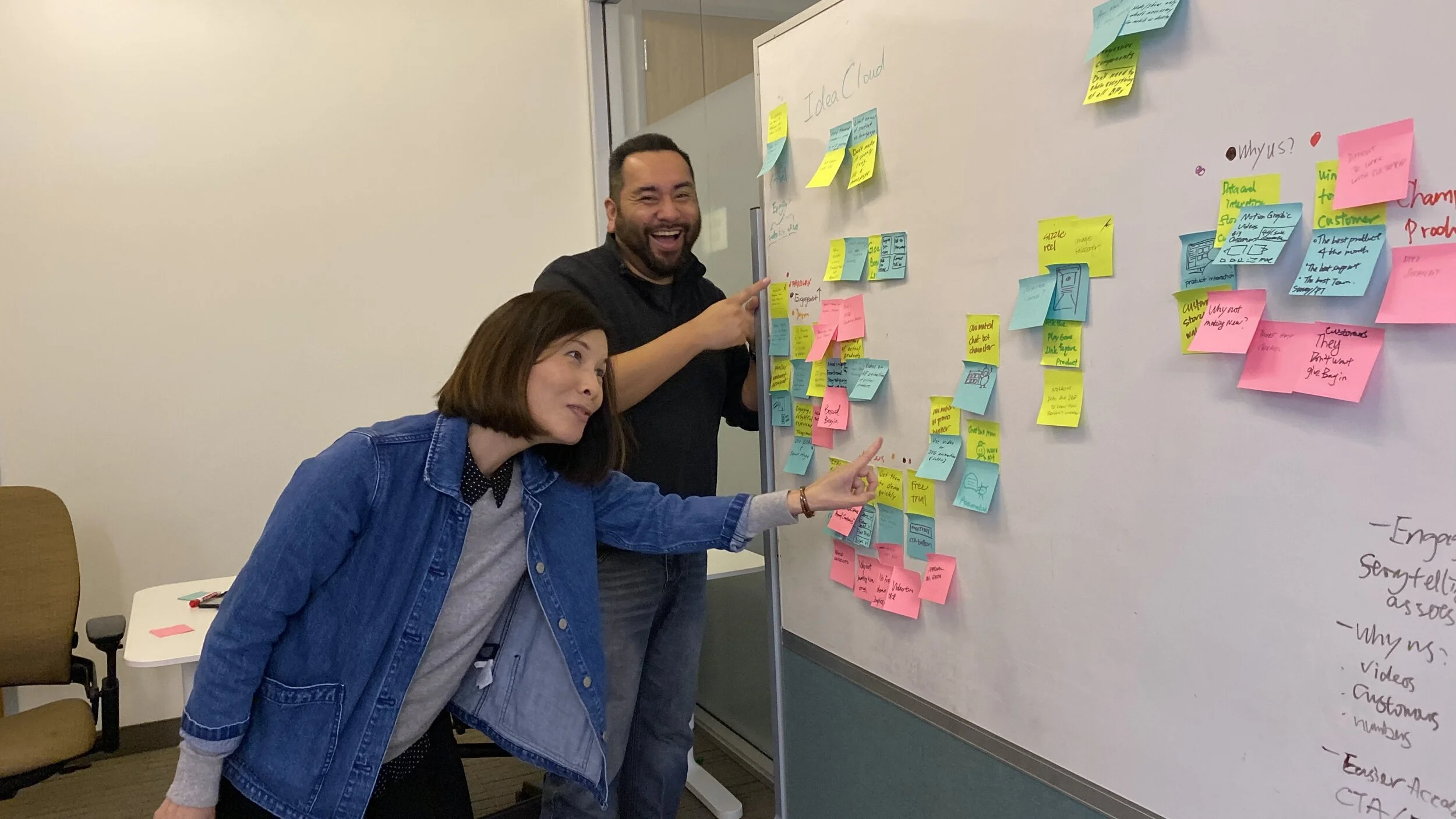
Created workflows based on data, analytics, workshops and brainstorming.
Awareness -> Consideration -> Evangelize
V2: The quick links on the bottom get the majority of first clicks from users, and they said it is beneficial. So we moved the quick links to the top.
I am keeping what's a new section due to the user's behavior on the site.
V3: Based on recent user testing, user reflects that autoplay is moving fast, and they have a hard time to read through it, and it was gone. So we changed it as filters.
Adding customer stories with ground evidence and added more customer brands on the page.
Design system
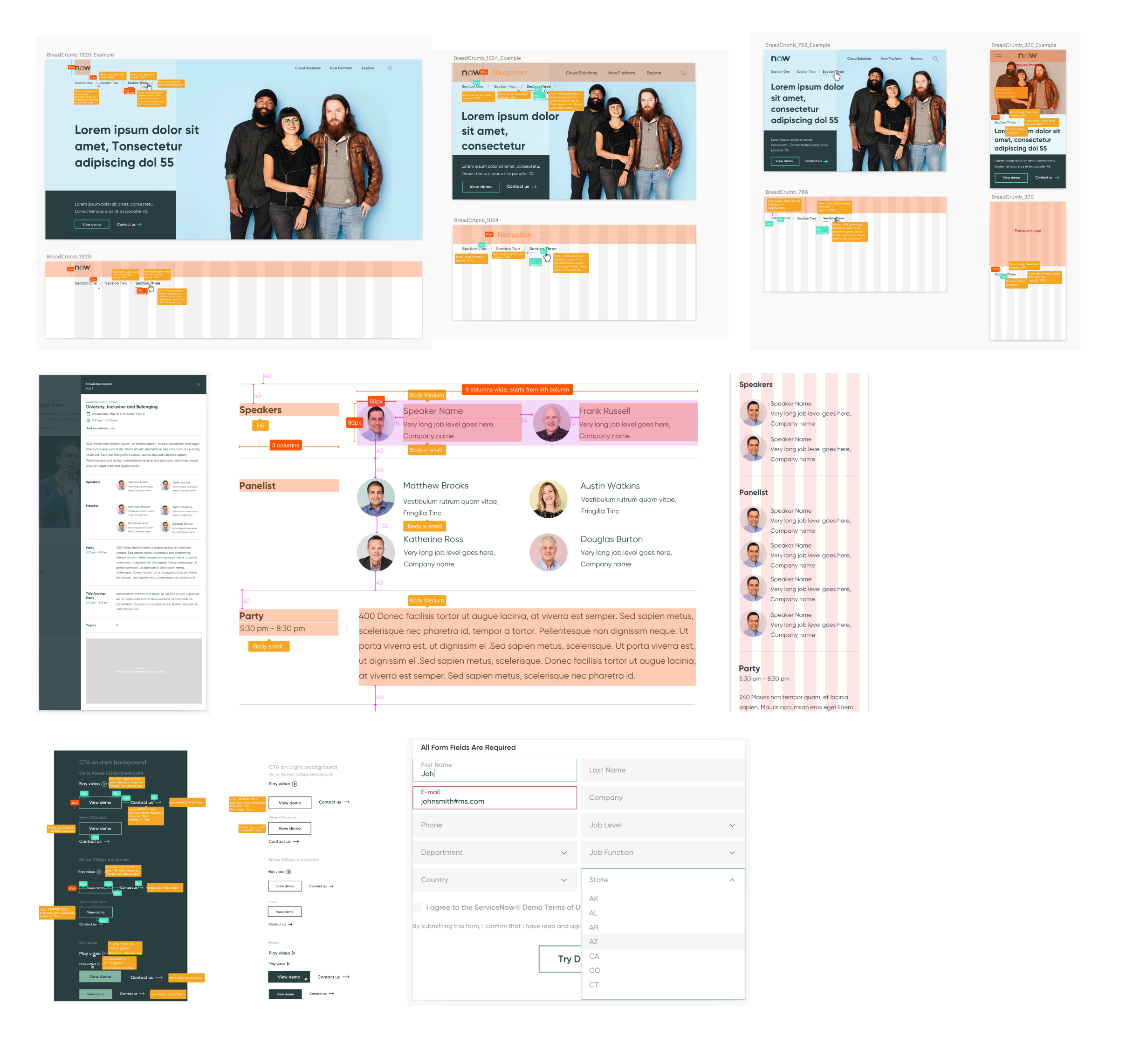
Component Design
Components and Handoff
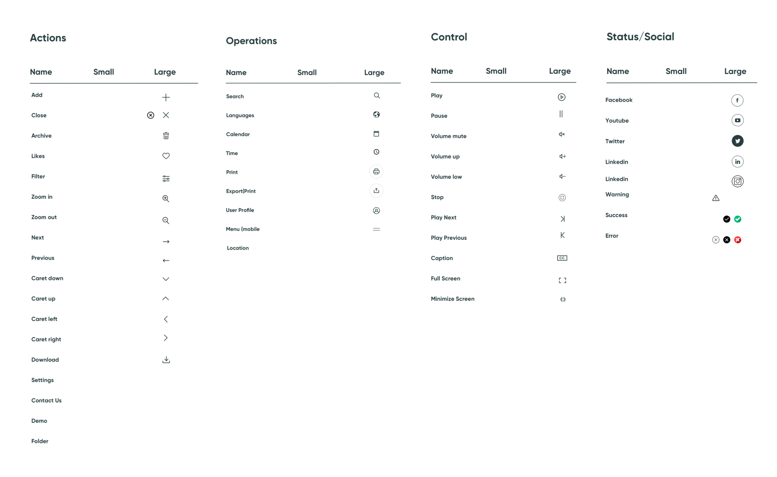
Icons by Categories
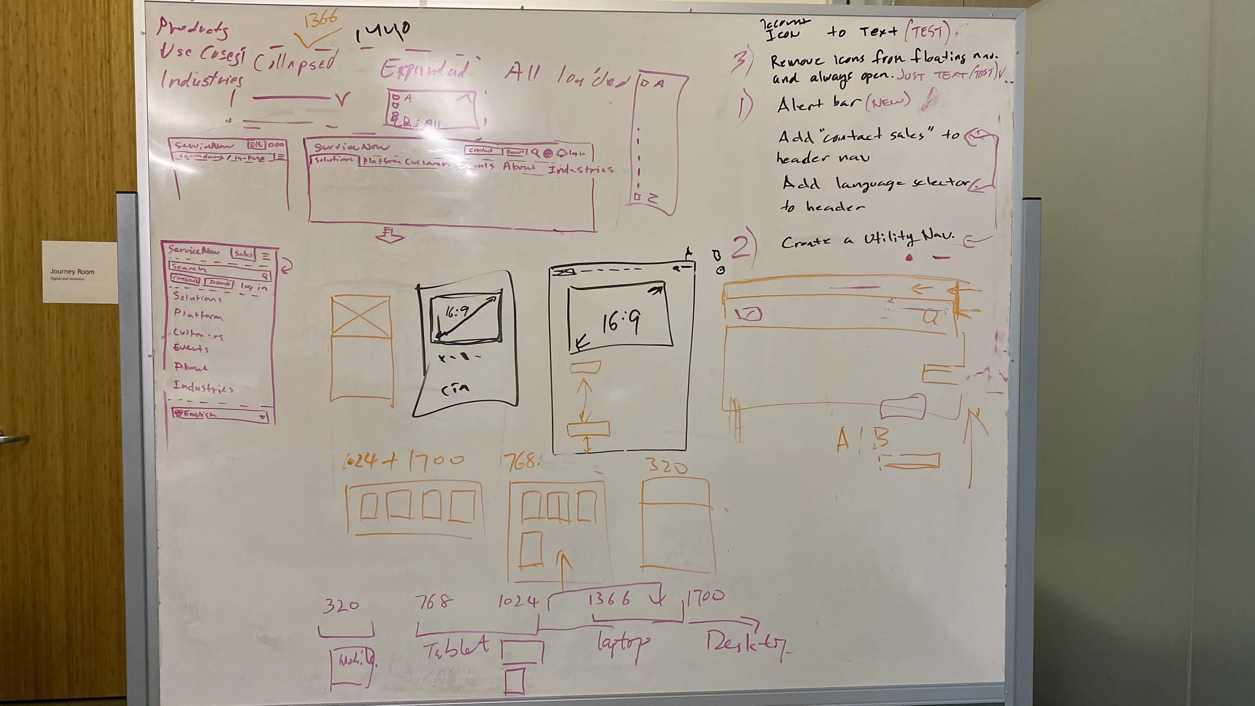
Process Proposal
More efficient and cooperative process proposal
🌻 Thanks for reading.

