Freshelf
I worked with a local startup on for their project “Saving Energy, Reduce Waste”. I led a team of 5 to design for the final idea, Freshelf Mobile App which helps customers to reduce household food waste and provides a quick and easy way to manage their food at home.
Duration:
3 Months
Team:
2 UX Designer, 1 Visual Designer, 1 Front end developer, 1 Business Analyst
Tools:
Team Lead, User Research, Ideation, Interaction Design, Visual Design
Deliverables:
Research Findings, Interactive Prototype, High Fidelity Mocks, Specifications, Presentation
Introduction
Food Waste Problem
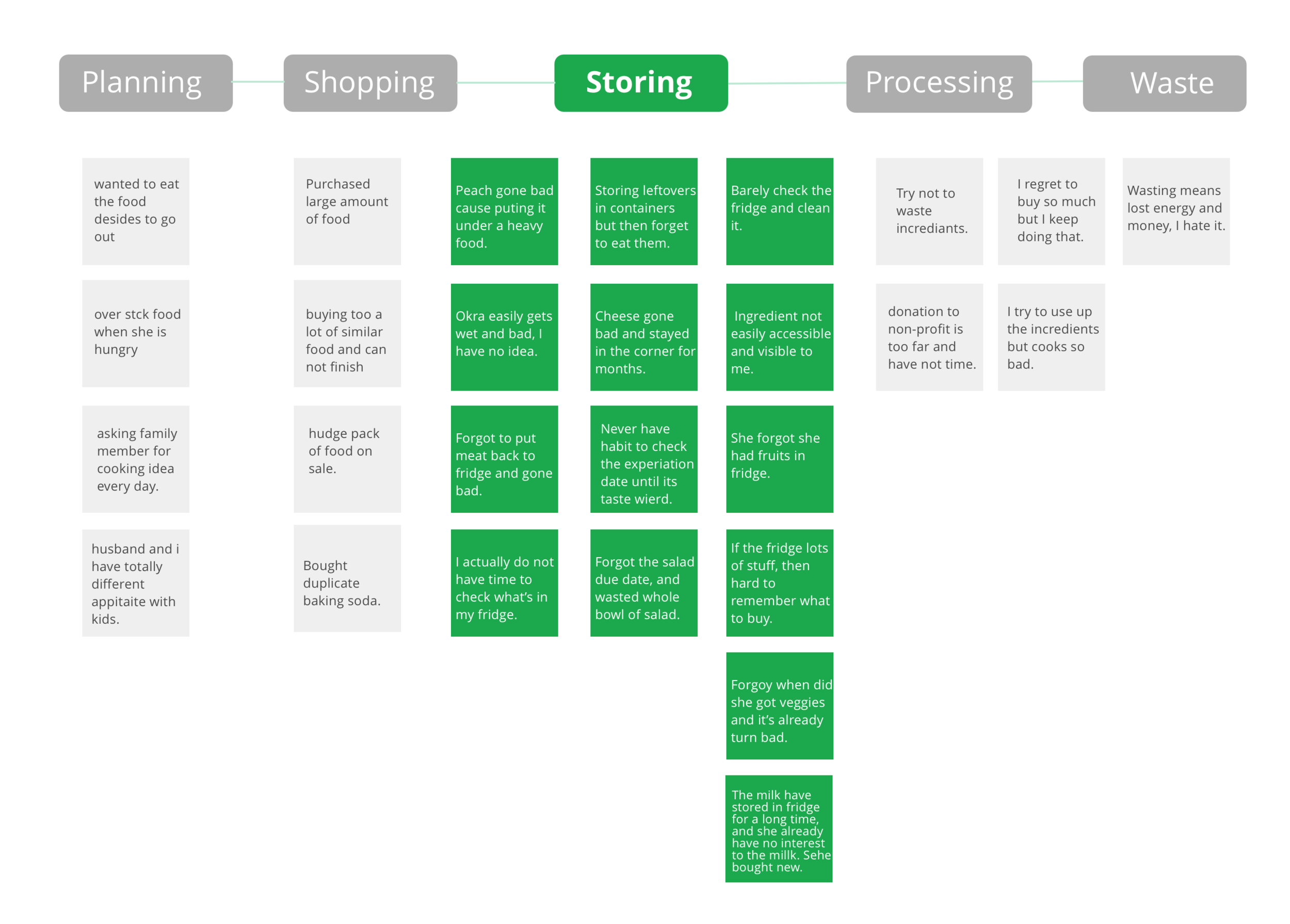
Food waste is happening at every stage of the food cycle, from planning, shopping, storing, and processing to cleaning. We focused on the issue of food storage to reduce household food waste and maximize the food value.
Food waste has grown 204% since 1960, according to NRDC report.
Design Question
The Solutions
Research Informed Solutions
Easy food entry
Customized food status and storage reminders based on time, space and location
Food tips and recipes based on shelf inventories
Visualization for food usage and recommendations
Add family members to organize together
Design Process
Discovery
User Interviews
We explored 3 main questions:
How do customers shop, store, and manage food?
How frequently do they check their inventory?
How frequently does the food go bad and how do they deal with it?
Contextual Inquiry
We asked users to think aloud while they shopping, and to record their shopping experience. Also, we walk into visited their homes to observe their food managing management methods.
Competitive Analysis
Based on competitor analysis, we found there are 3 common problems:
Navigation is confusing and work flow is unclear.
A recorded history of food items is not supported Does not support history for previous food record.
Food storage tips based on what food a user has are not provided Didn’t have combination of food storage tips with how much food do you have.
Findings
Insights from phenomenon
The majority of wasted food is fresh
The longer food is stored in the fridge, the less desired it is to eat.
Customers don’t have time to check inventory.
Spontaneous events and plan changes result in extra food in the fridge.
Food stored improperly causes waste.
Remembering expiration dates brought a high mental load.
Synthesis
Affinity Diagram
Breaking down the big problem and focusing on the storing stage of food waste.
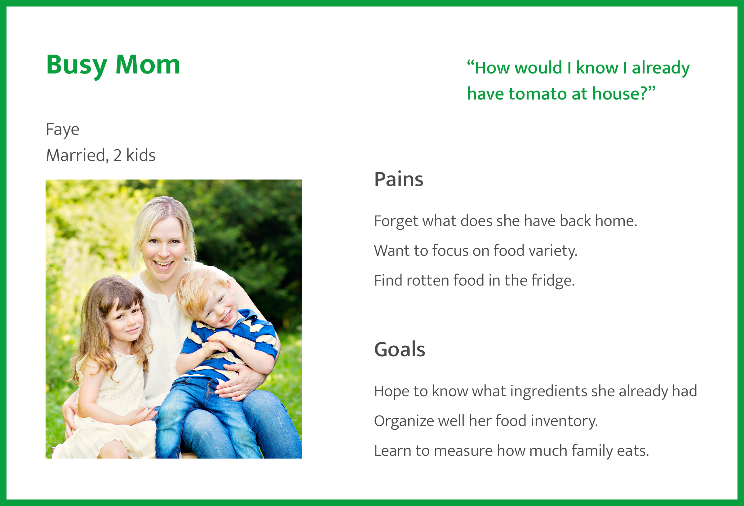
Personas
We created two different types of personas to distinguish our target audience.
Storyboards


Busy mom’s use case:
Popup events
lack of food storing knowledge
Single person’s use case:
Existing food inventory
Unexpected rotten food
Journey Map
We created user journeys for both new and existing customers.


New User:
Happy when they see organizing tips.
Happy to see recipes
Return User:
Happy when they find a way to store food
Happy the product allows the family to participate
Ideation
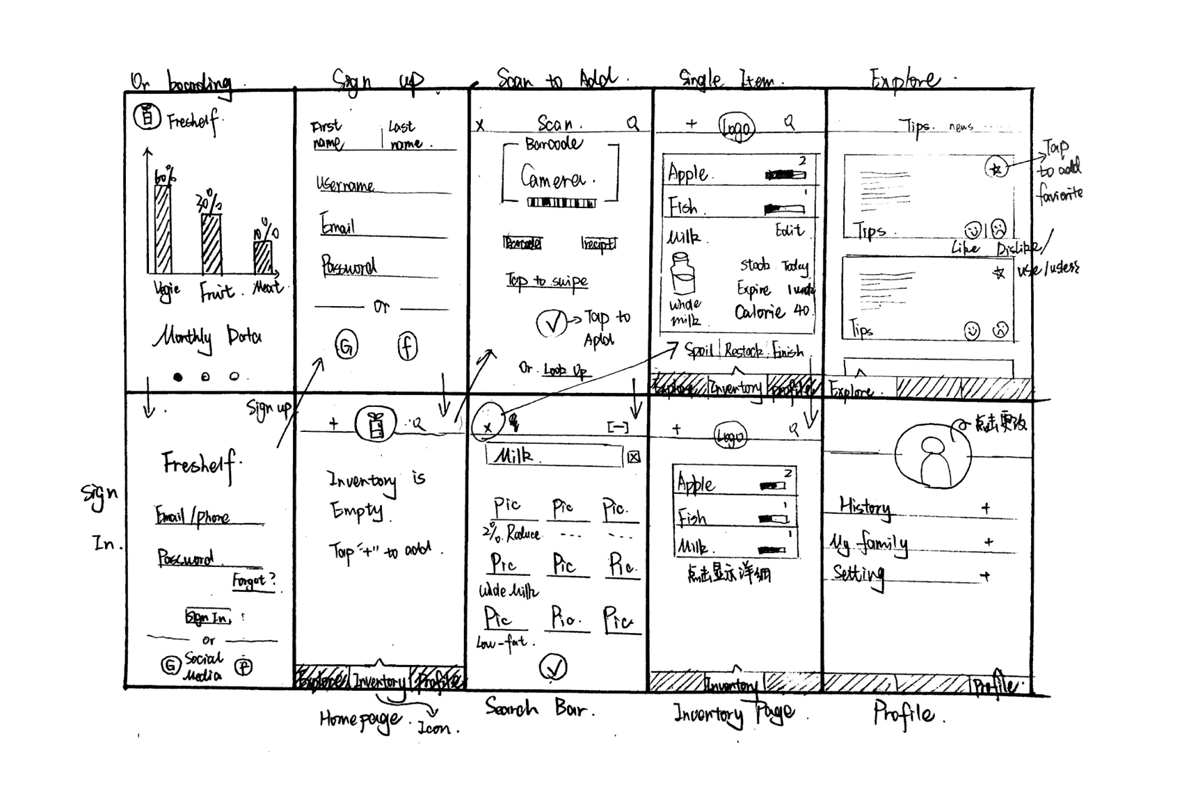
We brainstormed and wire-framed several ideas and we decided to go with a mobile solution because it is portable, accessible and available most of the time.
Goal: Create a quick, easy, user-friendly food management tool.
Final Design
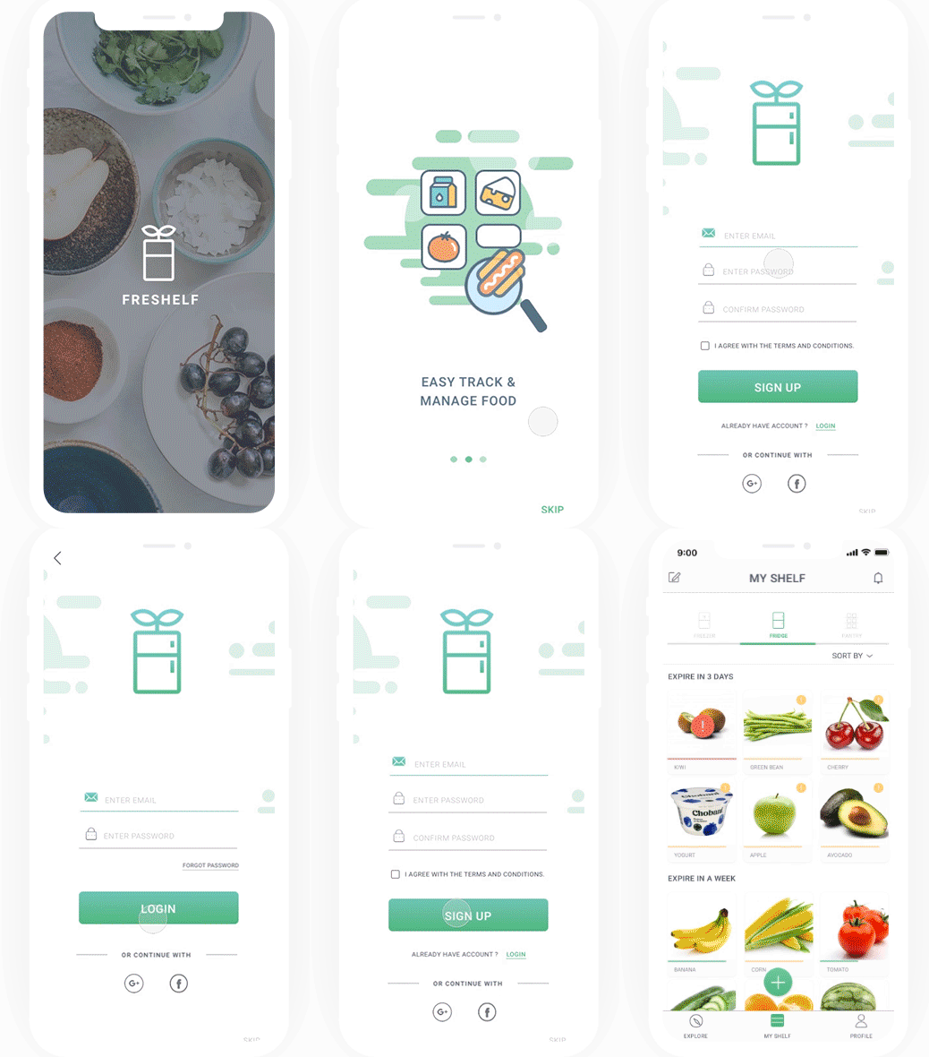
Structural login and sign in process.
V1 was a simple Sign Up process with a big caption to indicate enter. After user testing, in V2 we decided to add a login process and fewer items on the screen to avoid distracting the user.
Adding in a better and smoother way
V1 was focused on putting the barcode and receipt on scanners together, but 80% of users did not see the function, so in the V2 we decided to separate the two functions and make them stand out.
Personalized reminders based on time and location.
Users could receive notifications based on location and time. The default provides 3 notifications around breakfast, lunch and dinner times. Users could customize the reminders based on their own schedules.
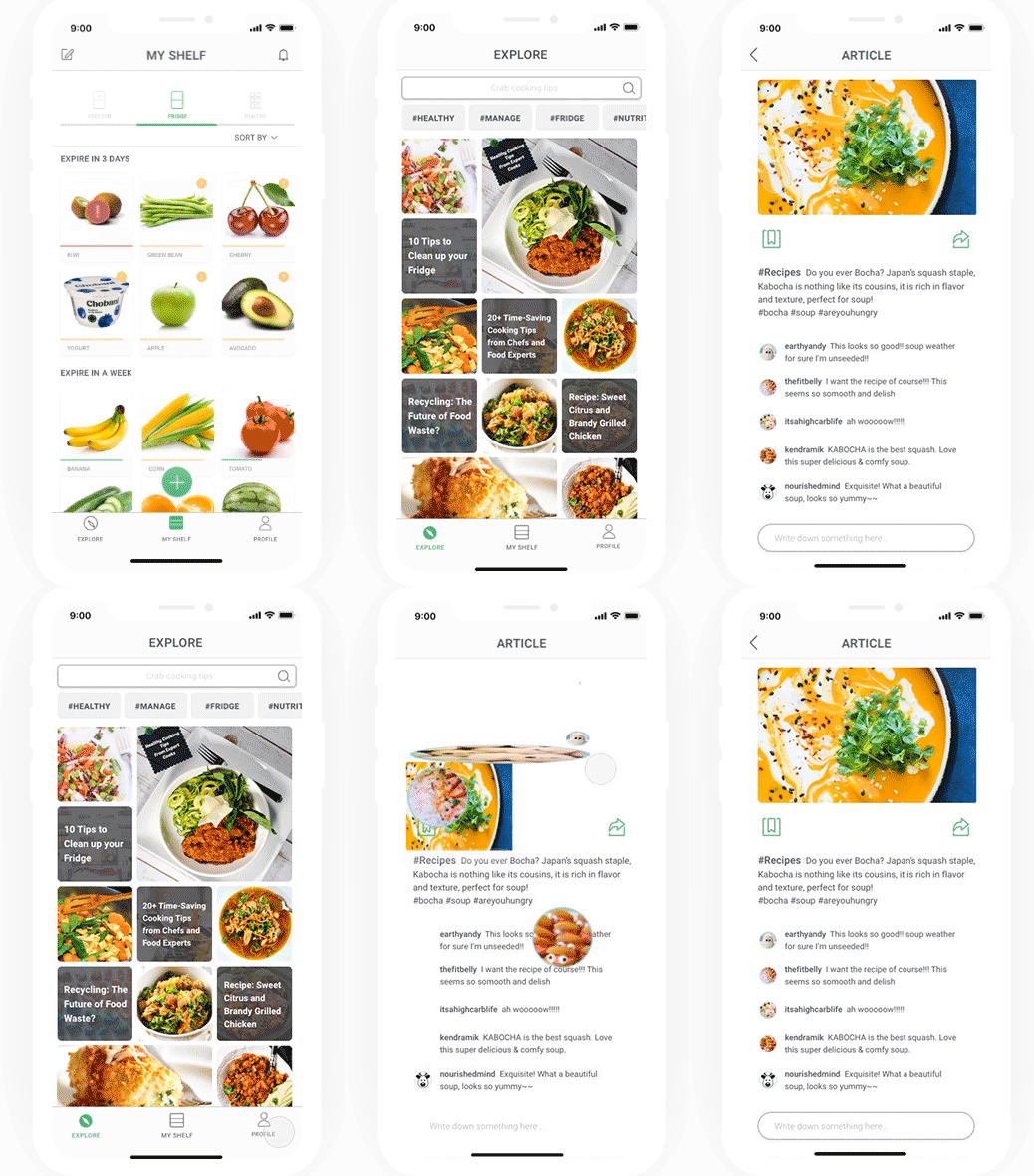
Explore tips and articles to boost your food knowledge.
V1 contained a lot of information including users profiles and posts. After research, we decided to focus on sharing useful tips rather than user-generated content, but users still had the ability to comment.
Overview of your food history
Our competitive analysis showed that no exciting food management app allows the user to look back on how many foods they have consumed. A clear visualization could help the user better understand themselves.
Prototypes
Paper Wireframes
Wireframes
Inventory display design and highlights for important information.
Three different ways to add items makes adding products easier.
Explore food tips and recipes , food purchase and food waste history, and add family members to list.
Personalized reminders allow users to personalize alerts and notifications.
Style Guides
Consistent Design
Usability Study
We interviewed 5 people to test our final prototype. We not only received high recommendations from people but also they asked to use the app immediately at home.
“I am a part-time group chef and I had lots of waste at home, I was looking for a product like that.”
“I would recommend everyone look at the summary report about their food waste, it’s so intriguing.”
reflections
Narrow down the scope.
During the researching stage, I encountered difficulties moving forward due to finding so many reasons that we concluded for food waste. I keep revisiting our original goal to make sure we are were on the same page. Later, I realized that food waste is too broad a problem to focus on that we should focus on one specific aspect to be effective.
Insights are abstractions of a phenomenon.
When we analyzed interviews, we found reasons for food waste to be things like “I forgot I had it” or “I am too lazy to deal with it.” However, considering those comments in context, they were not the ultimate explanation. Jumping to conclusions about laziness or forgetfulness can make it difficult to find the true issue. Only analysis within real-world contexts produces accurate insights.
Prioritize from chaos.
We all have different opinions and ideas about what we want for all users in our interface, but making the user feel overwhelmed is not our goal. Simplify information and make it more discoverable and accessible for users.
🌻Thanks for reading.


